The color scheme of a magazine is very important because it is one of the first things that a
reader notices. The title of the magazine should be a color that is used throughout. It should
also depend on the cover image that is used in the background.
reader notices. The title of the magazine should be a color that is used throughout. It should
also depend on the cover image that is used in the background.
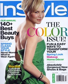 |
This InStyle magazine’s color scheme is very simple with few dominant colors. The main background is white with the title background being blue. Also the dress of the model is green which acts as a statement color and is incorporated in a few of the cover lines.
|
 |
This Elle magazine incorporates all pink and purple cover lines with the exception of one which
matches the model’s outfit. I like how the outfit used on the model is very neutral and doesn’t clash with the bold colors of the cover lines. This prevents the magazine cover from looking too busy or overwhelming. |
After researching and looking at multiple magazine covers, the ones with simple color schemes
appeal more to me. It prevents too much attention being taken away from the model in the picture.
Colors that I’d be interested in using for my magazine are yellow and white with pops of other bright
colors. I think this would be fitting seeing as I’m planning on making a spring or summer edition
magazine.

No comments:
Post a Comment